
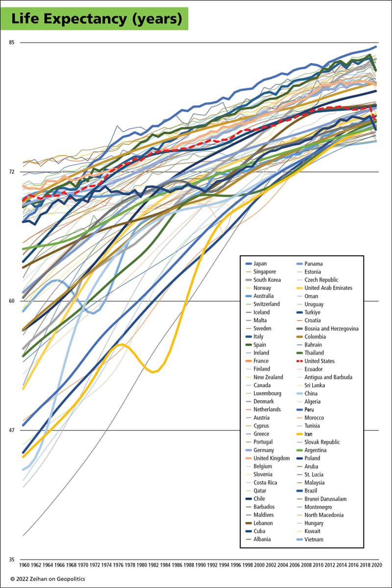
Any time I attempt to plot out any data set of global scale, the result is going to be a splatter of clown vomit. This graphic – showcasing global life expectancy – is no exception. Unfocus your eyes and stare at it long enough, and you’ll see patterns. Maybe even God. Or at least Bob Dylan.
Here’s what I see:
First, the industrialization effect.
There’s more to industrialization than steel and factories. There’s antibiotics, hospitals, ambulances, dialysis machines, electricity to enable emergency surgery at night, tractors, trains, supermarkets, vitamins, sewage systems, sidewalks, curbs, stop lights, seatbelts and airbags. All these and more reduce mortality, especially mortality among children. Most of the countries that began in the lower rungs of this graphic in the 1960s have since enjoyed a half century of industrially driven health, nutrition and safety advances.
Second, the US health care system is a mind-bendingly spectacular ziggurat of blazingly hot trash. Americans spend roughly triple the amount on health care of the average citizen of other developed nations in order to achieve health services that regularly rank in the bottom third of humanity. A few years ago I was broadly supportive of Obamacare, as the idea of reducing costs and increasing quality for the world’s most-expensive, least-efficient health care system sounded sexy. Unfortunately, the “reforms” made American health care even more expensive and even less efficient.
Grrrr.
That’s before you take into account that the US is the first-world country closest to the equator, resulting in mass application of air conditioning technologies resulting in more sedentary lifestyles. Ergo why the US (the heavy dashed red line) started sloping much less aggressively upward in the mid-1970s as the South started getting A/C everywhere. It isn’t just the bean dip, but also that we eat it on the couch while binging The Great British Baking Show. That was also before a wave of opioid overdose deaths that began in 2010, roughly when the US data stopped improving at all due to the infamous “deaths of despair”.
But perhaps the biggest take away is the sharp drop-hook at the end of the data due to Covid. The Americans’ Covid experience was…awful. American corporates focused on hygiene theater (Covid is a respiratory virus, so sterilizing surfaces doesn’t move the needle at all), while somehow not simply vaccines but masks became a national political battle. Consequently, the US lost over one million people to the disease, the single largest burst of deaths to a single exogenous factor in American history. It also pushed US life expectancy not only out of the world’s top-50, but below countries with notoriously chronic health crises such as China, Colombia, Albania, and Qatar.
Now it isn’t quite as bad as it looks. Part of this is the nature of the data itself.
No two countries gather or assemble data the same way. Smooth lines indicate update-as-you-go estimates based on indirect measurements such as tax receipts, economic growth forecasts, school attendance, pension payouts, and so on. Jagged lines indicate “real” data that registers actual death figures in more or less real time. Which is a statistics way of saying smooth-line countries will update their Covid-era data in a year or two, and many of those revisions will share the hockey-stick-like character of America’s.
But even with that understanding, this is still plenty bad.
One of the United States’ primary advantages over the rest of the world is its healthy demographic structure. Having a lot of land and resources means it’s easy to raise families: cheap housing, cheap food, cheap electricity. Having scads of young families rounds out the work force now, generates scads of consumption-led growth now, produces the scads the children which enable the system to continue, and leads to scads of more advanced workers which run the overall system down the line. Covid sliced away more Americans than every war – declared or otherwise – since 1866, combined. That isn’t something we simply walk away from, and not simply because a lot of us…didn’t.
Here at Zeihan On Geopolitics we select a single charity to sponsor. We have two criteria:
First, we look across the world and use our skill sets to identify where the needs are most acute. Second, we look for an institution with preexisting networks for both materials gathering and aid distribution. That way we know every cent of our donation is not simply going directly to where help is needed most, but our donations serve as a force multiplier for a system already in existence. Then we give what we can.
Today, our chosen charity is a group called Medshare, which provides emergency medical services to communities in need, with a very heavy emphasis on locations facing acute crises. Medshare operates right in the thick of it. Until future notice, every cent we earn from every book we sell in every format through every retailer is going to Medshare’s Ukraine fund.
And then there’s you.
Our newsletters and videologues are not only free, they will always be free. We also will never share your contact information with anyone. All we ask is that if you find one of our releases in any way useful, that you make a donation to Medshare. Over one third of Ukraine’s pre-war population has either been forced from their homes, kidnapped and shipped to Russia, or is trying to survive in occupied lands. This is our way to help who we can. Please, join us.